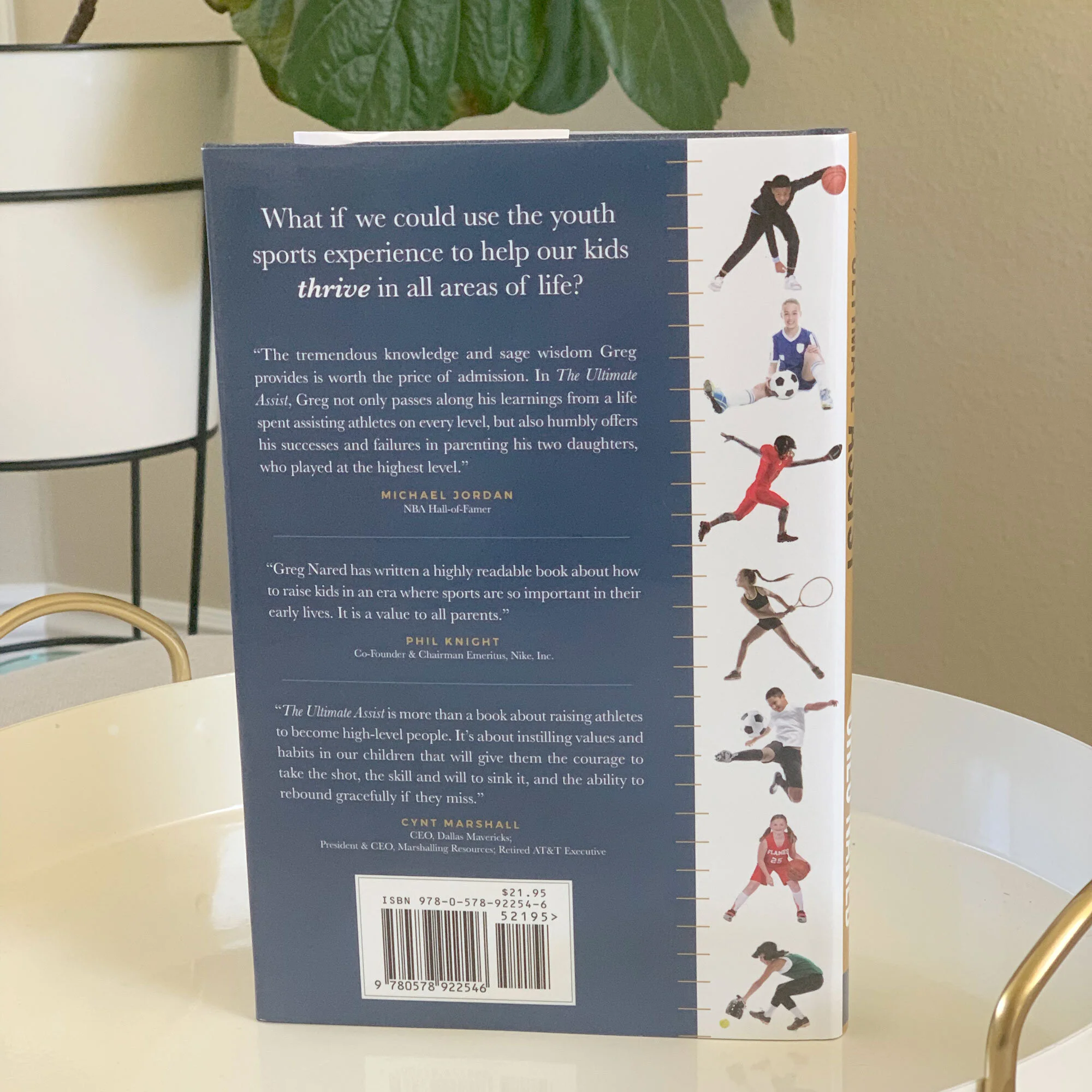
the ultimate assist // Book cover & jacket design, book interior for print & ebook
I recently wrapped a book design project for new author, Greg Nared, senior vice president of the Dallas Mavericks. He expertly coaches parents on how to help their kids succeed in life, through the lens of elite youth sports. He offers practical tools for the mental and physical aspects of youth athletics, reminding us of our role as parents, and that (shocker) winning isn’t everything. Greg gives instructions for determining values, setting goals, envisioning “the dream” and pursuing it with key ingredients such as fundamentals, humility, and really hard work. He gives great guidance for those whose kids want to take their athletics career all the way through college and beyond, like his daughters did.
I designed the book cover and jacket, book interior and ebook. It’s available now on Amazon! I highly recommend you pick up a copy if you’re like me, currently navigating parenting and coaching up aspiring young athletes. Fall sports are about to kick off. I’ll be walking my kids through the resources found here to help them dream big, set goals for the season, and create a daily schedule to manage their training and responsibilities.
Many congratulations to @gregnared, and editor Drew Tilton @asio . Thank you for inviting me to be involved in this creative way to help bring your book across the finish line. It is an invaluable resource!
Stephanie Mack // Brand Development, Web Design, social media graphics & book interior
I’m still on a whirlwind high from preparing for today, “Launch Day”, for my new client Stephanie Mack. Her debut novel, When We Blinked, hit Amazon today and is already topping the charts. She put together a dream team of creatives to execute a gorgeous book with all kinds of style and heart. The talented Zak McIntyre designed the cover of her book, and Drew Tilton directed us all through design, editing and production. He brought me in to design the interior and create a promotional website. While we certainly did those things, this dream project evolved into so much more!
Brand development (my favorite!)
Designing her book interior (it’s so pretty!)
Epub for Kindle
Social media graphics
Book club kit for her devoted readers
Photo shoot with Kimberly Hope Photography
& a gorgeous website
…not to mention newfound friendship.
Her book is live TODAY! I can’t even wait to celebrate with her, and her team tonight at the launch party. She has been a dreamy client, with warmth and kindness, passion and conviction, and loads of cheerful exclamation points! It has been such a delight getting to work with her, especially for such a significant milestone as this.
Congratulations Stephanie! You are a treasure and I hope today, and all that follows, is all you hoped and dreamed it would be.
I was repeatedly distracted while typesetting her book and getting caught up in the story. I’m receiving a freshly printed copy today, and I plan to curl up and read it from cover to cover ASAP.
Check out the book page on her site to learn all about it, and download the first chapter free!
In the coming weeks, I’ll share more of her brand development, and the project from start to finish on my website. But for now, we celebrate! (and then get a full night’s sleep)
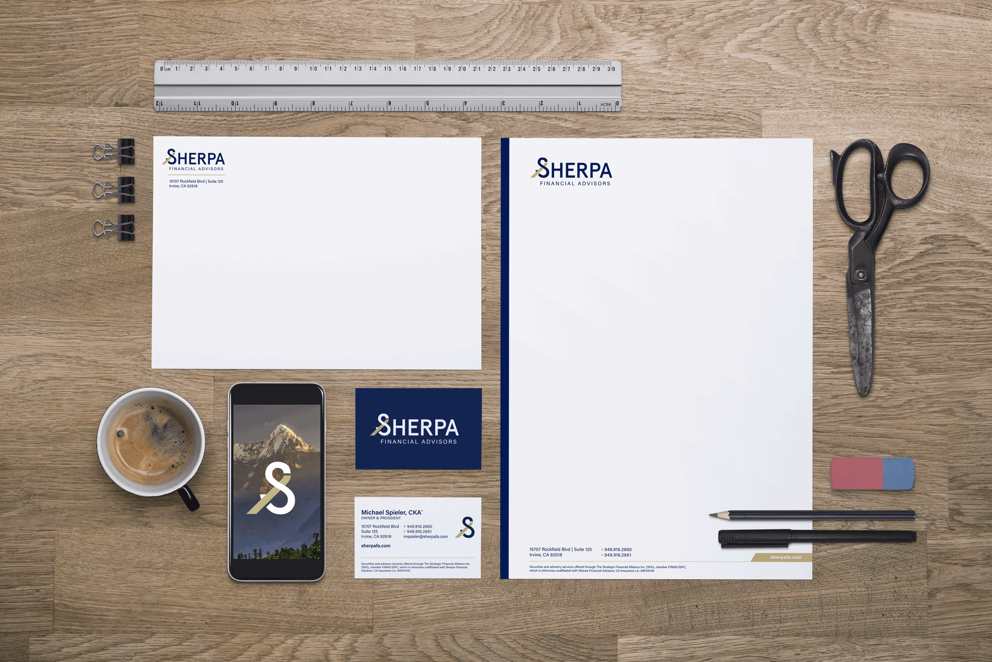
SHERPA FINANCIAL ADVISORS // IDENTITY & STATIONERY PACKAGE
Sherpa Financial Advisors has been in business for over 20 years. When Mike and Kristin Spieler purchased the business, they had desires of updating the existing brand. I took them through extensive client homework, getting them to think through who their ideal client is, how well they are doing at reaching them currently, what their short and long term goals are, and how a new identity would help to accomplish them. With these essential details in mind, we were able to start talking about concepts, colors and fonts. I created and presented them with three concepts based on their target audience and long term goals for their business.
Sherpas have long been regarded as highly experienced mountaineers in the Himalayas. Just as these Sherpas have years of experience and training to help climbers reach the mountain peaks, Sherpa Financial Advisors strives to use their vast knowledge and years of experience in wealth management to guide clients through life’s financial peaks, valleys and difficult terrain to ultimately reach their life goals. Initially we thought through how to incorporate the message of the Sherpa into their business mark. We considered mountains to represent this theme. In my mind however, since they were using a lot of nature and mountainous terrain in their photography I didn’t feel that it was essential to show the journey so literally, but rather to find a subtle, creative expression of this concept.
While they liked the identities that played more literally on the Sherpa theme, they found themselves continuing to be drawn to the fluidity of the 3rd Concept. As I communicated in my presentation, the mark shows a journey with an upward trajectory. The S shape representing Sherpa’s role in leading their clients along the way, with the upward stripe in the center reflecting their growth, with Sherpa Financial Advisors’ guidance. The reversed ampersand (& symbol) represents a collaborative partnership, and communicates to clients “relationship” and “interdependence”. It also subtly shows the rewards of investing: challenge on the front end, a summit at the top, and then an easy downhill journey. The identity is bold, professional and original.
We are all pleased with the finished product! And I look forward to seeing them apply their new identity throughout their business.
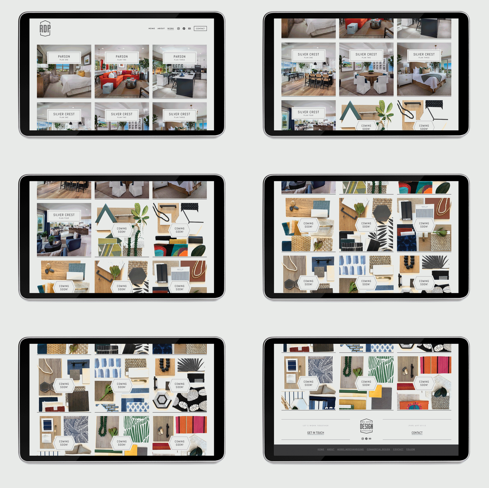
Real Estate Design Professionals // Web Design
Rachael called me over a year ago to create a splash page for her new business. She intended to do a full site in the future, but for the moment she just needed to gain an online presence before a big meeting with a potential client. Before the end of the day, I had her set up with a simple Squarespace website, calling out her services, contact information, and pulling her Instagram feed to keep the site feeling “alive” without ongoing maintenance. That single splash page served her needs for over a year…
In June of this year she called me again. She had enough work to keep her very busy, had hired an associate, had professional photos of all of her projects to date and was now ready to make her site into an online portfolio of her work. She wanted the site to be clean and modern, letting the photography speak for itself. I believe we accomplished all that we set out to do.
Sometimes it makes sense to come out swinging with a full website marketing your brand and services. But sometimes, going the simple, conservative approach is best. She didn’t wait until she had a cohesive brand, website and collateral lined up in order to start working. Just the opposite. She started working! And overtime, she got great projects and a very impressive resume of work. By searching her portfolio of projects you can quickly tell that she is in high demand, with several projects in the works. Check back soon to see the finished products! Congratulations Rachael, thank you for letting me be a part of growing your business and sharing your work with the world.
The Courage to be Weak // Book cover, interior, ebook & promotional website
It is always an honor to be entrusted with a client’s project. Working with Joe Storr, and editor Drew Tilton, on this book design was a joy, and quite an accomplishment too helping to carry the project across the finish line - from a finalized Word document on Joe’s computer, to a published book available for purchase on Amazon, and a site to market it. I’d say it was a huge success:
If you go to all the effort to write a book, don't take shortcuts with your design. Call Natalie! In Natalie, I got a partner in the publishing process who was devoted to my project and delivered an exceptional design. I constantly get comments on my book cover and how it draws people in. And the interior flow is clean and very professional-looking. She's a joy to work with as well. I already told her that I'd be reaching out soon for her help on my next project! - Joe Storr, Author
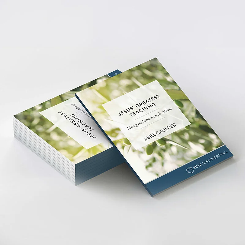
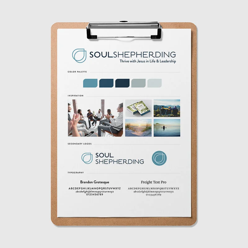
Soul Shepherding // Identity and Style Guide
Soul Shepherding has been well established for over a decade providing resources, connection and training to pastors and leaders, helping them thrive with Jesus in life and leadership. This is near and dear to my heart, as a pastor's kid. Pastors are always pouring out, it's so essential for them to have a network of support and grace where they can be poured into. This is what Soul Shepherding does. And with so much wisdom, and love for God and His church.
What they never felt quite confident in, however, was their creative presence, identity and brand awareness. Founders Bill and Kristi brought me in last Spring to help them finally establish a logo to give a visual to what Soul Shepherding is, and where they want it to go in the next 5, 10 and 20 years.
Together we talked through their mission statement and goals, identified their target audience. We pinpointed keywords for their brand, determined their tone and terminology, then we each gathered visual inspiration to put pictures, colors and textures to the work that we had done thus far. Now with a pool of words and images I created an inspiration board for us all to stack hands on. This board would be the driving force behind the next stage: creating their long anticipated logo.
A late submission sent us in a new creative direction. They wanted the word “empathy” to be added to their keyword list and they showed me a picture of the hieroglyphic for the word. It looked like a Ouija Board pointer to me - eek! Nothing like a challenge to make creative work exciting.
This was my task, using the hieroglyphic as my inspiration, to create a logo that conveyed mirroring the life of Jesus, having empathy for ourselves and others, and acknowledging that this is a lifelong journey.
Easy right?
I set to drawing…and drawing and drawing and drawing. All the ways you could draw an S to look like a stream, all the ways you could create a shepherd’s staff to look subtle or abstract, all the ways that this hieroglyphic shape could be made to look more fluid and contemporary. I like clean design, so when I’m creating I always make a big mess of scribbling concepts, then I take it to the computer, once I have it on the computer I ask “how can it be simpler?”. I ask this over and over and over again, til I determine, it can’t be simpler without losing it’s meaning. I got the glyph down to just the faintest outline, and then made a copy and overlapped them. And bam. That was it. The two instead of one, showed mirroring and relationship, by overlapping them it created an infinity like loop to convey a lifelong journey, and where they intersected made a subtle cross - keeping Jesus at the center. I created a custom type treatment that made a great compliment to the new mark. With “Soul” bolded it offered emphasis and helped to balance the two words’ difference in length.
This creative representation of their mission and values was just what they were needing to take their ministry to the next level. Reaching their target audience with an identity that will attract them visually, and relate to them spiritually. I am beyond thrilled with the final product, and they are too. Win, and win!
Thank you Bill and Kristi for the opportunity to develop Soul Shepherding’s brand with you. I know you will have great influence for years to come, pointing pastors and leaders to Jesus as they seek emotional and spiritual growth. Many many thanks to Gina Stockton for her appreciation for my thoughtful approach and for her encouragement throughout this project. Thank you Monty Kelso, my long long longtime friend and personal cheerleader who contributed his experience and insight to this project. And lastly a shout out to Drew Tilton. A chance meeting and your God given gift for connecting people brought this all about. Many thanks friend.
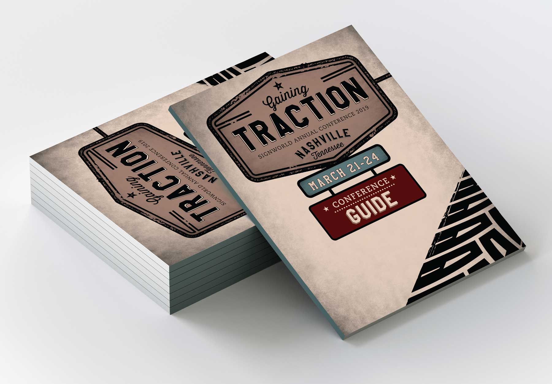
Signworld business partners // Annual Conference creative & graphics
This is the 3rd year that I have had the pleasure of working with Signworld Business Partners’ creative and graphics for their annual conference. Each year they decide on their theme and I provide creative concepts for them to choose from. This year’s theme “Gaining Traction” was really fun to design. The conference is taking place in Nashville, Tennessee so I opted for an antique street sign to hold the title, with vintage colors and textures. The driving skid marks were an addition from another concept, which I was glad we added in as the texture adds a lot of character and style to each piece. After landing on the creative direction I then designed each individual piece using these creative elements: the conference program, LOTS of signage, a multi-arched entrance unit, help desk, drink cards, name badges, floor graphics, screen graphics, aisle markers…Every element is branded with the Gaining Traction artwork which makes for a very cohesive event that gets bigger every year!
STORY ACRES // identity & packaging
A little passion project for my friends and favorite beekeepers of Story Acres. I sketched this little logo while we sat in the IF: Conference together in Dallas last month. I’m living vicariously through them as they navigate the ups and downs of farm life on 26 acres in Tyrone, GA. They inspire me. Their adventures make me want to tend to my own little plot of land with love and care, vision and purpose. I miss them, as they were once near but are now far. But I love that they are following this calling with great intention and finding beauty all along the way. I love having friends who dream big! And I love getting to use my own unique gifting to show my support.
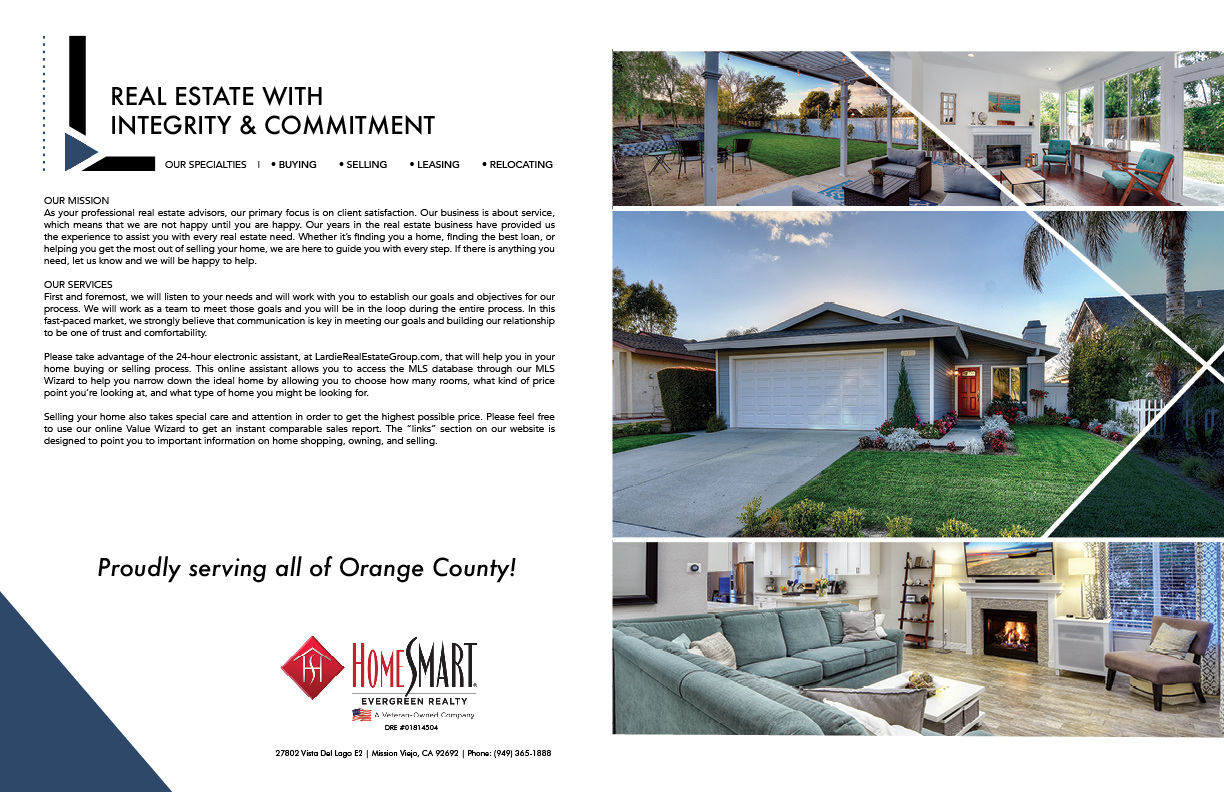
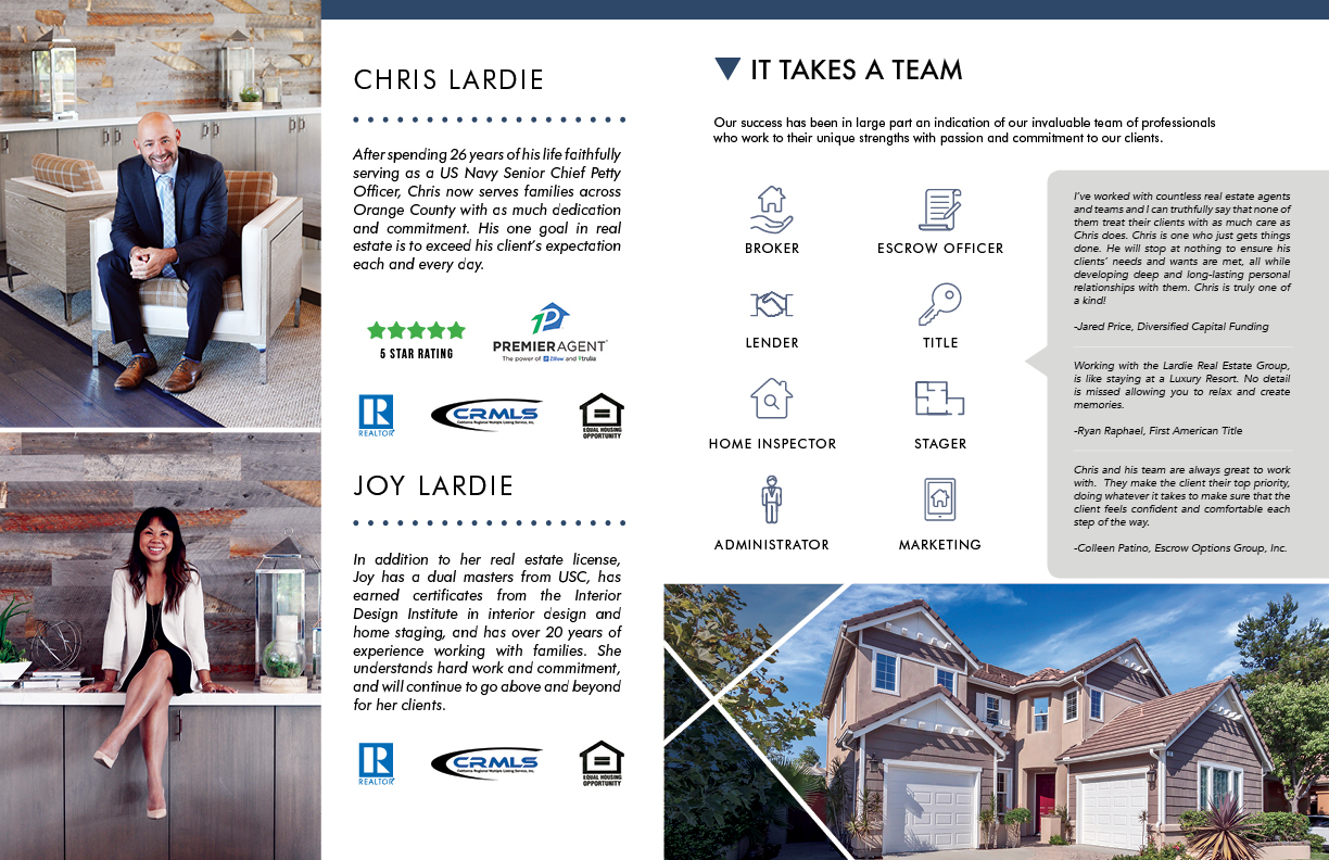
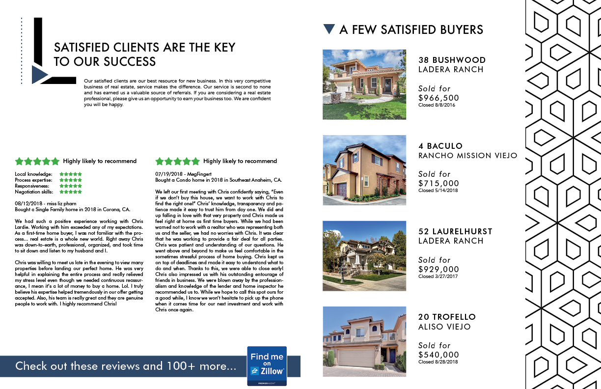
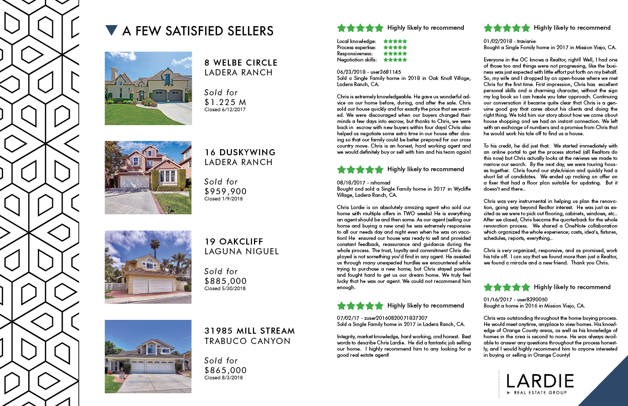
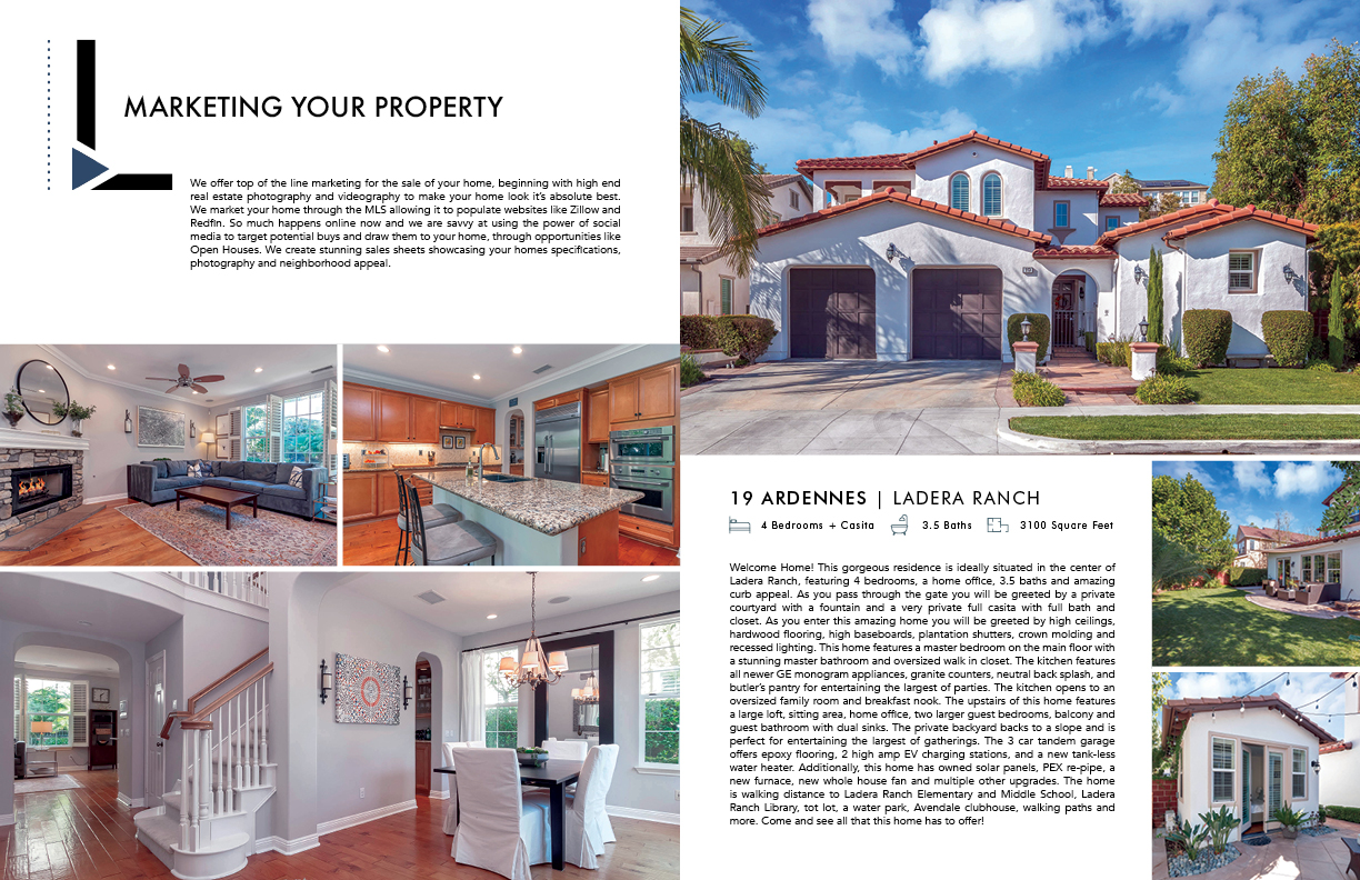
LARDIE REAL ESTATE GROUP // IDENTITY & COLLATERAL
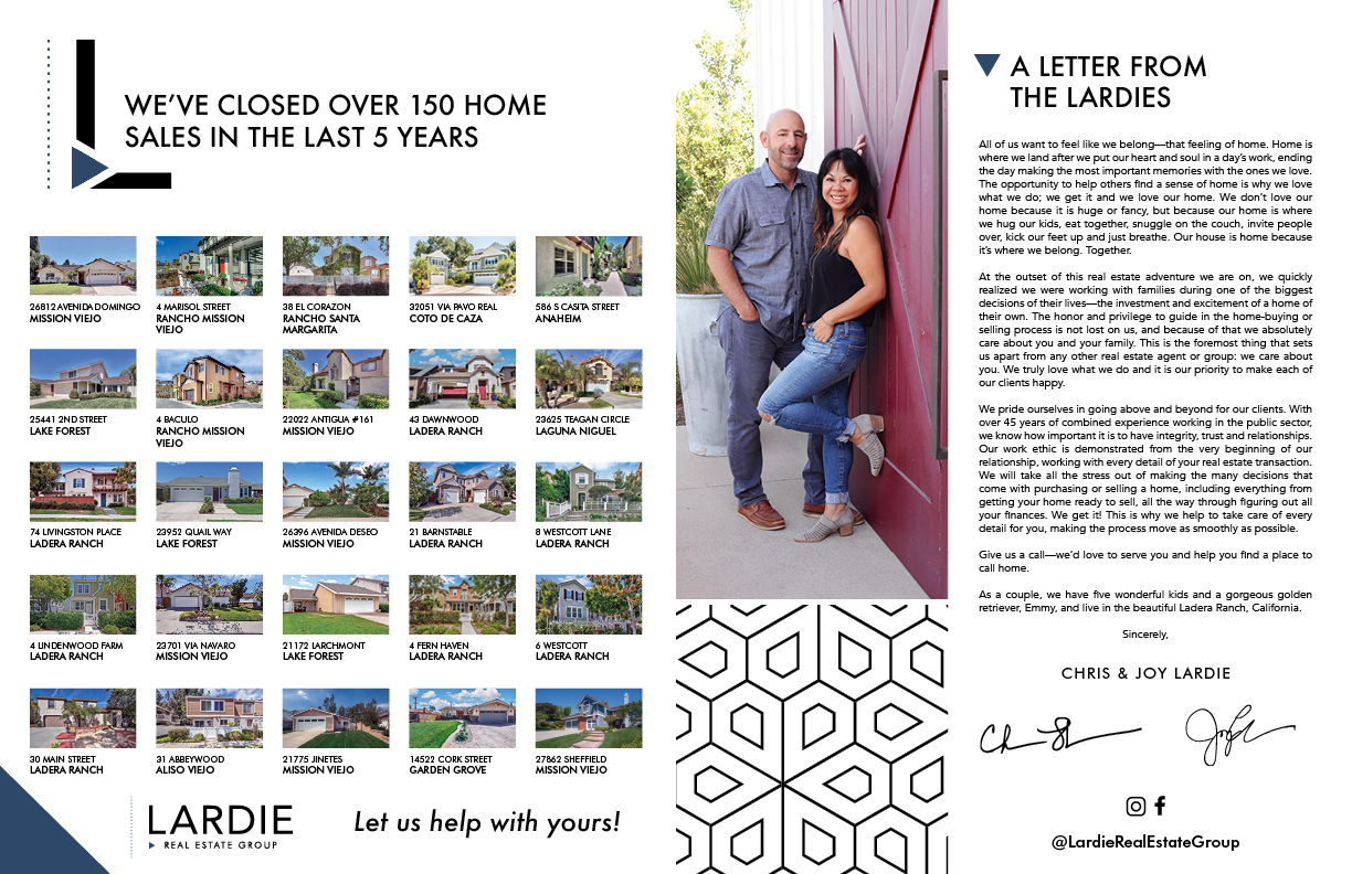
My friend and client, Chris Lardie, spent 26 years of his life serving as a US Navy Senior Chief Petty Officer. He now serves families across Orange County in real estate, with as much dedication and commitment. Chris has already helped over 130 families find a home to call their own! I have had the pleasure of working with him for 3 years now, creating his sales sheets and direct mail marketing. We wrapped up 2018 celebrating his tremendous growth in the real estate industry, and now in 2019 he’s making the change from Chris Lardie Realtor to Lardie Real Estate Group. This change called for a rebrand and new collateral to highlight his growing presence and team. His care and commitment are unmatched. If you are in the market for a real estate agent look no further. Check out all of his 5 star reviews on Zillow or get in contact with him at lardierealestategroup.com
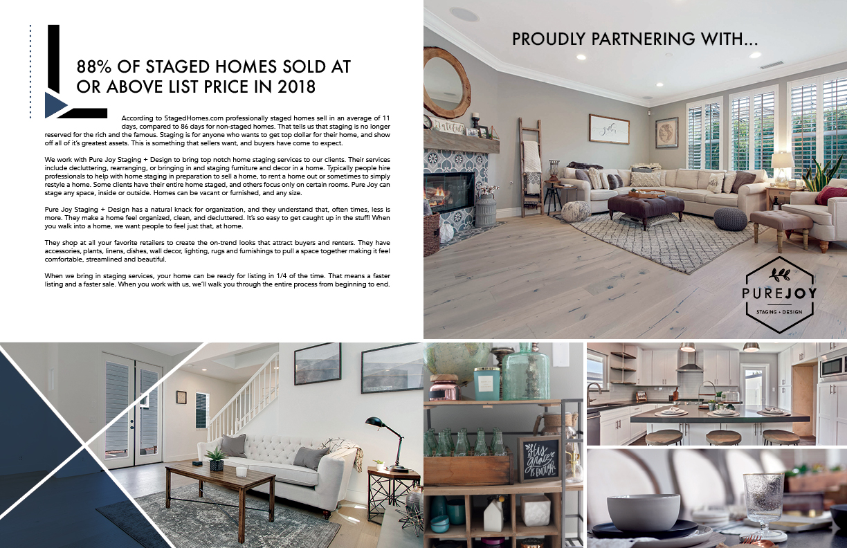
PURE JOY // MINI MAG
I helped Pure Joy create and launch her business just 18 months ago. I designed for her a fresh identity, supporting print pieces and a swanky website highlighting her work. The business took off immediately - thanks to a beautiful online presence and Joy’s hard work, enthusiasm and hustle! Now she has an office space, two adorable employees, the dreamiest staging warehouse, and is in high demand for staging homes throughout Orange County! For her office warming party she had me create a “Mini Mag” of her work to date and staging philosophy. We love the finished product!
chasing mercy PHOTOGRAPHY // IDENTITY, COLLATERAL & WEB DESIGN
Here’s a glimpse of a project I’ve just wrapped up, for my friend Alyson from Chasing Mercy Photography. She has a passion for cherishing every moment, and a unique gift of capturing them. Together, we created her identity, collateral and website. I gaze dreamily at the finished product. If you’re wondering if it’s already time to start thinking about Christmas Cards...yes, it is. And lucky for you, she’s currently booking Mini Sessions! Check her out and see the full site at chasingmercyphotography.com!
COACH BALLGAME // IDENTITY
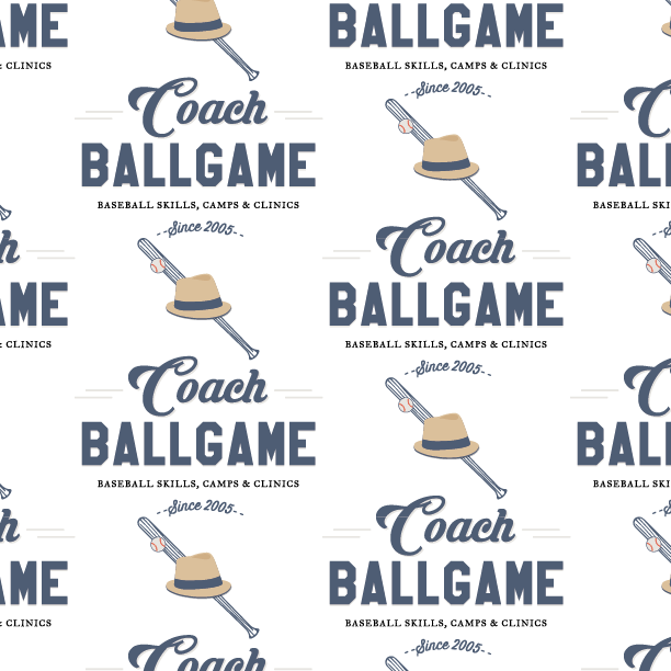
I am already a super fan of Coach Ballgame. My kids have attended multiple camps, we quote him in daily life, we watch his videos and follow his blog. He has drawn my son, Evan, into an all out LOVE of the game of baseball. So when he asked me to design his logo, I was so excited I couldn't even wait to get started. Together we created visuals to come alongside his unique brand, that was already alive and swinging. I'm pretty jazzed about the final product, and I'm eager to see the new logo and brand elements showing up at his Spring Break Camp... If you have a ballplayer in your life, sign him or her up for a Coach Ballgame Camp! They'll leave sweaty, dirty, happy and full of new and hilarious knowledge of ballplayers from the 1980s that will remind you why we love this game so much. He cares about character first, fundamentals & skill, followed by so much fun!
Chick-fil-a west region // 1 billion milestone
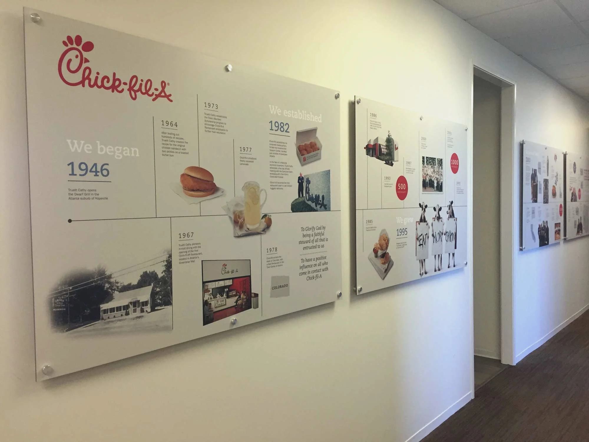
What an honor to help Chick-fil-A's West Region celebrate their 1 Billion Milestone as a region. I had the privilege of designing a logo for their Milestone event, a commemorative cow, as well as a 20-foot acrylic, 60 year timeline of the company's history; outlining how their move West has prompted substantial growth, and dramatically influenced company wide culture. I was invited to attend the celebration and was blown away by the stories of the pioneers who had vision for what could be when there was nothing. This is such an inspiring company to work with. I'm beyond grateful for the opportunity.
Photography by Huan Vo-Ta
PUre Joy // Identity & web design
I love how this identity turned out for new client Pure Joy - The Premier Source for Staging + Design in Orange County. She wanted black and white, with a clean, modern feel. I used the combination of the rotated hexagon, giving the impression of a pitch on a house, with the hand drawn leaf inside, to convey bringing beauty inside any four walls. I love the added emphasis on Joy, which also happens to be the owner's name. It suits her perfectly. When I get to work with a start up on a passion project, my heart sings with joy. I love working with other creatives to collaborate on a project, and watch their excitement grow as their dream becomes reality.


